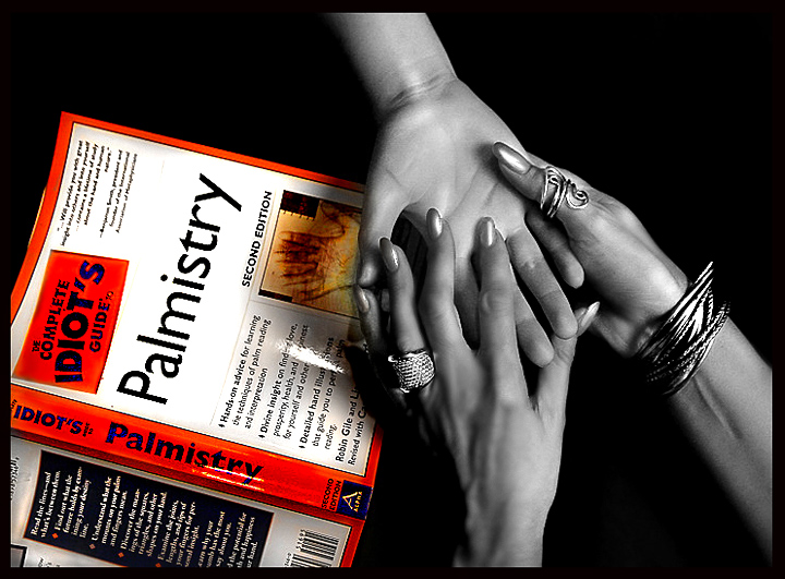
funny idea, the selective desaturation is an interesing approach and one that actually works pretty well here - the hands and jewelry are very dramatic
I almost feel that the book is large enough that the selec. desat doesn't quite work for me here. There is enough white on the book, I think the title would've stood out wonderfully on it's own without pulling in the orange-red coloring. I love the image of the hands though. Great in b/w otherwise.
So much to like here: the contrast between the bright, colorful book and the B&W hands, the detalis in the jewelry, and the overall composition.
But I'm left wondering whether that's a plastic hand you're holding (if it's not, waaayyy too much noise reduction or blurring), and the jaggies on the book's title are pretty big (try blurring them a little to take the edge off).







 Add photograph to your favorites
 Add photographer to your favorites


 Photographer found comment helpful.


