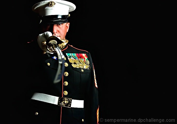
This is a self-portrait that I hesitantly entered. I'm thinking this shot will get between a 5.0 and 5.5 I actually enjoyed this challenge. I originally had some grand plans to incorporate a tank or some piece of weaponary, but in the end I decided against it. Besides I was still on holiday and I think my wife would have killed me.
Post Challenge Comments:
Very satisfied with the top ten finish. Thanks to all those who left comments and took the time to vote.
Statistics
Place: 8 out of 98 Avg (all users): 6.6891 Avg (commenters): 7.5652 Avg (participants): 6.6604 Avg (non-participants): 6.7000 Views since voting: 3783 Views during voting: 478 Votes: 193 Comments: 39 Favorites: 7 (view)
I gave this a 6. It's an excellent portrait. I would have scored it higher except I didn't like the composition. Some of the things that one learns at DPC are wrong! ;) When deciding on your crop/composition, look not at the subject but at the shapes and lines. Composition is about form, not content. (it is possible to use composition to convey themes, like isolation, community, dominance, etc., but even so you do it with forms.)
so i was totally going to do this with my staff sgt because i dont have my blues yet, but he busted his lip at the pool the day before we were supposed to shoot. oh well, maybe for the free study
I really like most of this shot. the hand and sword being up around your face makes it a bit too "busy" for my taste. Thank you for your service, and stay safe!
Master Sergeant, is it? That is the sharpest uniform in all of the US military services aside from my choker whites. :)
I like the way that you made the black of the uniform stand out from the background using the lighting. My only nitpicks would be that I would have liked the sword in better focus and the top of his hat not cut off. Overall, a very sharp image that exemplifies what we all stand for.
I don't care how much photoshop you do on this fella... he still looks like a dork. Are you sure he's a Marine? He looks more like a sailor or coastie to me. Where did you buy those medals? I didn't think computer geeks were allowed to wear fancy medals.
A nice effort on the classic ad for the Marines. The sword gets lost, though, and makes me want to move it out of the way so I can see you. I like the side lighting, but it'd be good to bring some detail back into the blown highlights in processing. Same goes for lost detail in the black cloth (I'm looking at this on a calibrated CRT screen, so it may be brighter on an LCD).






 Add photograph to your favorites
 Add photographer to your favorites

 Photographer found comment helpful.


