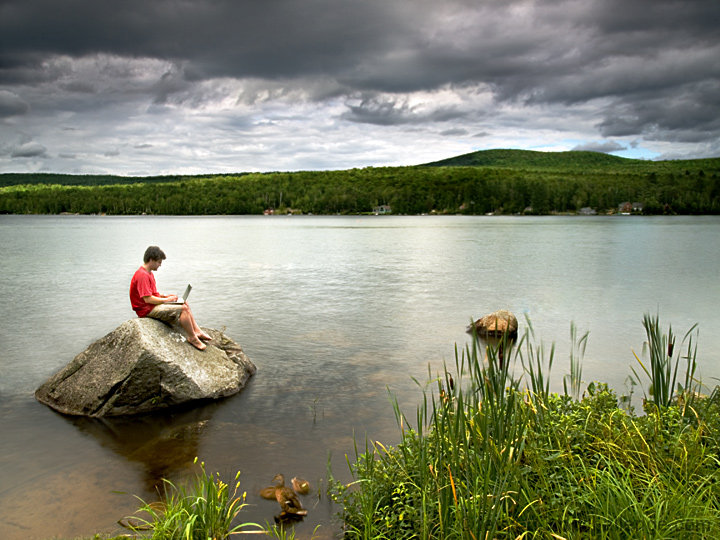
Groton Pond, Vermont: My wife's family owns a cottage here, so we go every August. This is basically the same view as my Morning entry, but taken from several feet higher. In this entry, you can see the rock isn't really all that big:
Thanks to my daughter, who handed the laptop to me after I climbed onto the rock and then hit the shutter release after I'd set everything up.
The ducks were a very pleasant accident. They just showed up as I started shooting. I didn't even realize they were in the shot until I started editing it.
Speaking of editing: the main thing was cloning out the bit of dock to the left of the rock and a tube that you ride on behind a boat that was out on the lake. Then it was many variations on brightness and contrast among the clouds, lake, and foreground.
Post-challenge: I'm very happy with the score and comments. This got 20 comments during voting, which is the most in the past 6 months.
With this entry, I survived week 3 of the Better than Average side tourney, where we have to beat our own overall average score. My target this week was 5.6950.
Statistics
Place: 21 out of 98 Avg (all users): 6.2634 Avg (commenters): 7.2778 Avg (participants): 6.0600 Avg (non-participants): 6.3382 Views since voting: 2859 Views during voting: 413 Votes: 186 Comments: 28 Favorites: 0
Nice shot Jeffrey, I didn't vote this challenge ... and I decided to poke around your site and see what you'd been up to lately.
I have to admit ... I don't think I would have picked you out during voting ... I guess you're just too far away for me to have recognized you.
Nice idea and very nice completion.
I just made reservations for visiting the area ... will PM you with details soon.
Hah - I didnt recognize you in this one. I just ofund this shot really pleasing and I expected it to score much higher. Very nice work Jeff. Very nice indeed.
Color Saturation and Hue: Colors are good, saturation could be a little higher, but is very good at this level. Hues are natural, skin tones are accurate.
Brightness and contrast: Brightness and contrast are both very well done. However the bright area on the lake distracts the eye a bit.
Focus and depth of field: Focus is sharp, depth of field is nice and deep, which is important in this image.
This is a very good image, but at the same time that bright area on the lake and other elements keep the eye in motion and distract from the subject. Since this is an advanced editing challenge, had you darkened the lake a bit, it would have really helped focus attention on the subject. Given the dark clouds, the darker lake surface would have also fit in well in this regard.
As is, it is a very interesting and enjoyable photo. Congratulations on a well earned top 25 finish.
Great stuff Jeff...another winner from Vermont. I really liked this one a lot, and wasn't sure that it was you. One of my top favorite shots in the challenge
Next time you head up that way, give me a shout - we have a place near Windsor, VT and maybe we can meet up...
Been looking at this one for a while. I like the idea, but would have preferred to have the person more prominent in the image. The motion blur in the grass is a bit distracting. As landscapes go, it's a little drab, but the juxtaposition of the high tech in the natural environment is a good one. (Oh, and I bumped you up one just because you got me to look long enough to notice the duck.) :)
Isn't this that pond in Vermont? Gortons, Gotons - something like that? Groton Pond...that's it! It is, I'm sure of it. I like this one better then the last one - 10






 Add photograph to your favorites
 Add photographer to your favorites


 Photographer found comment helpful.