Author Thread Comments Made During the Challenge
Post actions
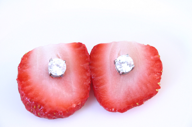
I like the idea of this shot but I wish I could see more of the structure of the strawberries (maybe the green tops still on or others in frame. The contrast is a little blown out so I'm missing the detail on the diamonds, which would be a nice contrast to organic shape of the berry.
Post actions
background on this is too white the strawberries and diamonds dont stand out as much to see more texture with it..
Post actions
Post actions
Post actions
Interesting use of a high key effect - I wish the berries were a little more "au naturel" so it looked a little more serendipitous. The cutting off of the top makes it look a little overly contrived. Great concept.
Post actions
Post actions
Nice idea, but focus if off and diamonds are washed out
Post actions
maybe with other wall it could have been a 10
Post actions
Post actions
Not sharp enuf and horribly off center. Serendipity... where?
Post actions
good idea. i would use one diamond instead of two. punch the other strawberry with the diamond to make it more real
Post actions
Too contrived for my tastes.
Post actions
Post actions
Cute. I think the lighting seems kind of flat here. There's no sparkle to the stones and it seems to be too bright.
Post actions
Different. Perhaps a bit too much highlite.
Post actions
nice idea I wish berries were a little more centered w/ warmer lighting
Post actions
Sweet, but I wish the earrings weren't so highly exposed.
Post actions
The idea is great. The picture however seems to be too overexposed and personally I'd prefer to see the subject centered in this case.
Post actions
The image is cliquie but the best of the bunch! Great treatment of white on red.
Post actions
Over exposed...unfortunately.





 Add photograph to your favorites
 Add photographer to your favorites


 Photographer found comment helpful.


