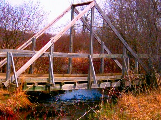
I don't understand how this bridge represents the theme of serendipity. As a composition it may have worked if the overall image were in sharper focus. As it is, the colors and textures, particulary of the wood, look washed out and bland.
Comment added later: I don't know if there was something going on with my monitor this afternoon but I swear the colors looked different to me when I voted and commented on this. Looking at it again, I would have to agree with the comments that it is oversaturated in color. I stick by my comment that it lacks textural detail in the wood.
Normally I would really dislike a reference to the challenge in a title, but I am convinced this is the bridge to serendipity and maybe adventure and beauty. I sure could recommend a lot less red in the image, and the top of the left beams are blown out.





 Add photograph to your favorites
 Add photographer to your favorites


 Photographer found comment helpful.


