I actually had a shot very similar to this I was going to enter, but did not because I dont think people would have seen it as meeting the challenge, even though I do...nice job.
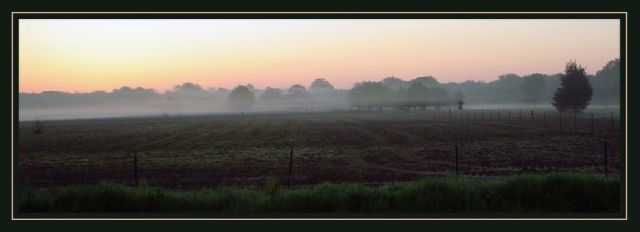
I'd level the horizon a little (i know others hve probably said it already, but they're right) and maybe play with the levels a little to enhance the silhouettes. i love the haze, and the colours are very nice. border is a little on the intrusive side.
good luck,
Pedro
Nice composition and content. It looks like it is not level and that is distracting to me. There is a nice tutorial at DPC on how to easily correct that if you use Photoshop.
Very nice composition and great "slim Jim" presentation. Would do well as an "inspirational poster" submission, but pretty difficult for me to se a strong silhouette. Pastel colors very nice. Not sure the thin white line in the border adds anything.






 Add photograph to your favorites
 Add photographer to your favorites


 Photographer found comment helpful.


