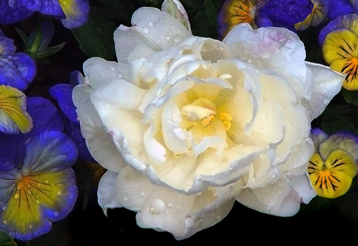
Original capture was May 2006. I like to walk the botanical garden to get my flower shots. I've learned to find flowers in the shade, or to provide shade (or diffused light) with an umbrella. This flattens the contrast. I'm figuring out how to use photoshop to improve the contrast, which I call tone mapping. But I googled tone maping yesterday & it seems the rest of the world thinks of it as HDR processing. Only instead of flattening the contrast in a high dynamic range image--I'm trying to improve the contrast of an image with low dynamic range. I'm also trying to figure out how to put all this into words. Hope I made a little bit of sense.
I'm wondering what your methods/habits are, if you care to share.
excellent .. love the wet look .. !!
and wot a wonderful combination of flowers .. those little pansy type flowers are beautiful with their colours and detail .. and they combine so well with the star of the show .. !!:)
ok .. i just read your comment .. and googled HDR and tone mapping myself because i thought i could learn something as well ..
i do very similar stuff to HDR in my processing a lot of the time, altho not from multiple exposures ... but just doing shadow/highlight and levels and stuff like that .. the resulting image probably isnt as good, quality wise, but at the moment i'm happy with the results .. seeing you put it out there i'll include the site i checked out in my comment .. FAQ - HDR images for photography .. good luck .. its not too difficult to understand, but make sure you're brain is fired up first .. lol .!!.:)
i love this shot. its like the light is coming from the center of the white flower.. also love the exposure on the other flowers. would love to know your methods/steps.
Whatever you're doing, pixelpig, it works for me. If you would share some of your processing steps I know we would all appreciate them.
I sometimes use a bit of tone mapping, using a new program called "Essential HDR" that I heard about here on DPC a week or so ago. I've used some of the other programs, including the one in Photoshop and the colors are too garish for my tastes. This one seems to be a but more subdued. As I work with it a bit more, I'll try to give a report.
But whatever you are doing is exciting and I like it very much.
Pixwlpig, I haven't a clue as to what you said. . . not how you said it. . . just what you said. My first line of attach in post processing is always level. Mid tone, high tones, low tones all get played there with before I do anything else.
But whatever you did here was neat.
great colors and water detail. I usually think of tone mapping as an hdr term. I'd be curious to know how you processed this. I've been using levels and curves lately to up contrast.




 Add photograph to your favorites
 Add photographer to your favorites


 Photographer found comment helpful.


