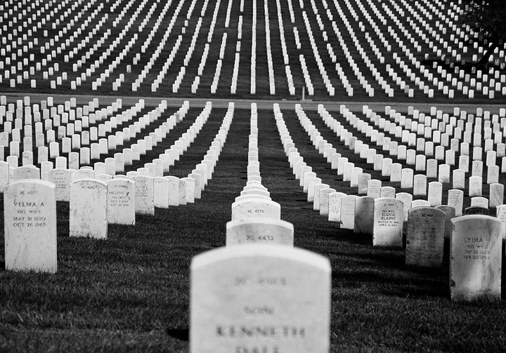
I took this shot without even knowing what the challenge topic was. It wasn't until 2 days later that I saw the topic and realized this shot would fit.
Statistics
Place: 10 out of 144 Avg (all users): 6.3534 Avg (commenters): 7.0000 Avg (participants): 6.1800 Avg (non-participants): 6.4578 Views since voting: 2159 Views during voting: 250 Votes: 133 Comments: 14 Favorites: 1 (view)
Oh, this is amazing! I'm such a big fan of national cemetery photos. There is something so gallant and noble about them. There is a place at our national cemetery that has the hills and the look like this, but it doesn't photograph well because there is to much "stuff" in the way. This is so clean and flawlessly beautiful. Congratulations on finishing on the front page.
Interesting shot.. it would be a little better if the tree was not part of the composition and also if the grave in the front center was not blury. Other than that.. the lines of graves are interesting and force the eye to move through the image.
Firstly, let me say that I like the contrast here - nice whites and good blacks - and I like the fact that I can read some of the words on the stones. I also love how you have addressed the challenge: to me, this is a good use of the word "fallen".
It's so hard to make rows of stones aligned in this fashion look good. I lived for many years across from a veteran's cemetery with stones just like this, and I know from experience how it is to photograph them. There's something about them being lined up so straight and alike that makes it difficult.
So I am having problems with the composition overall. It seems too tilted to the right. Also, the stone in the foreground being so centered is not as engaging as putting your main element off to the side and up a bit, for example. It's a bit hard, too, how that stone is so out of focus. Being bigger than the rest makes the viewer want to read it.
If you don't know that this is a veteran's cemetery, it could be hard to tell, as you took the shot from the "back" of the stones. I understand that it could have been an issue with not being able to shoot from the other way or something like that - but I do think the shot would have been more engaging seeing the actual soldier's names. Or, you could have had your title be something different (the "soldiers" part leads me to expect soldiers names and not a lot of "his wife") but I do not think that would hav ethe same impact.
One last thing - I know that when faced with so many gravestones of soldiers, it is a bit overwhelming to think of what they went through, and you might be tempted to capture the enormity of that in sheer numbers. However, getting closer to the subject, capturing fewer stones, may help it be more dramatic and emotional for your viewer.
I have been a bit harsh but I don't want you to think I hate the shot. In fact, it is a rare shot that can lead me to be so connected to it that I want to comment at such length. The image has a lot of potential and if you get the chance to shoot at that location again I would be so interested in seeing further photos!
I'm sure you've already received dozens of comments saying this, but I suppose I'll add my two cents as well: "the horizon's tilted!." :) If that could be corrected, I think this photo would have an even stronger first-impression impact. Those curves, lines, and patterns all add up for a very impressive composition.
The names on the gravestones interest me - I assume the widows of the soldiers are buried alongside their husbands? Are the names of the soldiers to whom the graves belong on the other side of the stones? Good monotone conversion. I am unsure about the prominence given to the central stone in the foreground - a little too 'in your face' for me, but apart from that a strong composition.







 Add photograph to your favorites
 Add photographer to your favorites


 Photographer found comment helpful.


