In RAW...
Adjusted Saturation and Contrast... maybe exposure too... maybe shadows too
In Photoshop...
More contrast, more saturation adjustments
Crop
Dodged/Burned
Cloned out some distracting dust and a bit of leaf (I think that's what it was)
Smart Sharpen
Neat Image
Border
Statistics
Place: 71 out of 144 Avg (all users): 5.6032 Avg (commenters): 7.0000 Avg (participants): 5.3333 Avg (non-participants): 5.7531 Views since voting: 864 Views during voting: 250 Votes: 126 Comments: 8 Favorites: 0
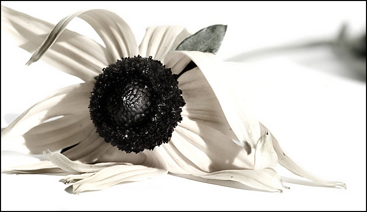
White on white is sooo hard to do. The front left is the neat part of your image. The right is too blown out. Was wondering why you did not crop it out.
It's actually a bright yellow flower that I desaturated 90%ish. I kept the right side, because that's the stem of the flower. Had it not been a Fallen challenge, I probably would have cropped it out.
White on white is sooo hard to do. The front left is the neat part of your image. The right is too blown out. Was wondering why you did not crop it out.
That is a pretty thought. It's brighter than I would be comfortable with because I am not a big fan of high key images. The bright and high contrast would look great as a print, but it bothers my eyes on a screen. It's not the image, it is just my thoughts. I like the composition.






 Add photograph to your favorites
 Add photographer to your favorites

 Photographer found comment helpful.


