critique club**
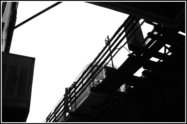
very neat photo! i like the contrast. border is great. there is nothing i would change about this picture. i love the title too. good job!
Like the idea that the subject is not silhoutted, and that the sky is perfectly blown out. Subject is positioned well, off center, but not formulatically in the tradition ROT positions.





 Add photograph to your favorites
 Add photographer to your favorites


 Photographer found comment helpful.


