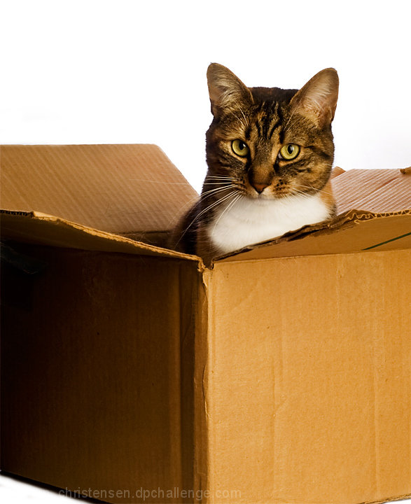
Trying to work with the cats again. It's always easier when you don't want them to pose...
Photoshop was curves to really whiten the whites, dodging and burning, curves again for contrast, a b&w layer opacity 5% for detail, cloned out some minor stuff, usm, resize, save for web. Pretty basic, but I'm happy with the result.
Statistics
Place: 47 out of 95 Avg (all users): 5.7010 Avg (commenters): 6.1250 Avg (participants): 5.5439 Avg (non-participants): 5.7664 Views since voting: 872 Views during voting: 364 Votes: 194 Comments: 10 Favorites: 0
First Impression: Cute kitty with a natural pose (which can be hard), nice warm colors, nice contrast without blowing out any of the highlights. Lacks that little extra something to take it to the next level.
Looking Closer: It looks like you tried to use the rule of thirds with your placement of the cat, but somehow the feel that you usually get with that just isn't there. Something feels off... perhaps the corner of the box right in front, also in sharp focus, that divides the shot? Maybe if you had taken this from a higher angle, or used a shallower dof? Perhaps playing with a tighter crop could have been an option. Also, I'm noticing the crinkles and nicks in the box.. not sure if that's good or bad, just something that caught my attention.
Overall: Not a bad score, but I think it lacked that little extra something to really catch the voters attention. Looks like many voters gave it a 6, saying it was nicely done and better than average. Comments seem to indicate the same.
Hope this has been helpful. Please feel free to PM me with any questions about this critique.





 Add photograph to your favorites
 Add photographer to your favorites

 Photographer found comment helpful.


