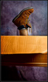
This was a difficult one for me. No ideas, no inspiration - but I felt o.k.-ish with this image. It’s crisp and clean, meets the challenge. However, as soon as I checked the other entries and saw how great a LOT of them were, I knew mine didn’t stand a chance. Great work, you guys.
Statistics
Place: 41 out of 95 Avg (all users): 5.8368 Avg (commenters): 7.4286 Avg (participants): 5.8036 Avg (non-participants): 5.8507 Views since voting: 2201 Views during voting: 340 Votes: 190 Comments: 11 Favorites: 0
I think this is an okay image. It definitely is very visually appealing at first glance but as I look at it a bit more there is sort of a harsh break between the sleek colors of the CDs and the textured blandness of the cardboard. Not terrible or anything, just a little bit weird for me.
I'll bet you had a lot of playing around with those CD's and the lighting in order to get the refraction just right. My only critique is that I am not fond of the way the box is cut off toward the bottom of the frame. The black border makes it look like it is the bottom of the box and it looks odd because it really isn't.






 Add photograph to your favorites
 Add photographer to your favorites

 Photographer found comment helpful.


