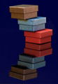
I thought this was quite creative. I love the sense of symbolism that goes with this too. If you do this again, watch for the shadows your support lines cast on the boxes. The colortone was an interesting choice as well. Congrats on the OOBIE! (ha - out of the BOX... kind of appropriate!)
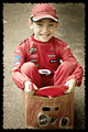
This works for me on fairly deep as well as immediate level: immediate because I am temporarily (I hope) surrounded by boxes and things; deep because of "attachment." Composition and lighting totally serve, as does the posture of the model. And fantastic concept of the boxes rising...
its bad state of affairs when a photo like this cant crack a 6.0 even.
I read the comments about brightness, about the model not being spunky. I really dont care about that. I love how this looks like an ordinary snapshot, except for the boxes.
If Magritte was photog hed have stuff like this
I was one of your 10's, and the only 10 I gave out for this challenge. Utterly fantastic, love the surreality and concept, and the processing (Urban Acid, is it?). Model's seeming detachment is perfect to get across the sense of surreal. Will go so far as to say this image is one of my favorites, out of all my favorites. :)
I didn't vote this challenge but did check out a few entries - this is one I checked out. I just read through your comments and obviously I'm odd, because I REALLY like the color cast/acid/whatever. Adds immensely to the surrealistic nature of the shot. Very nice work!
Excellent concept - if you cloned out all of the strings at the top it would be even better. Did you mean to have the white balance adjusted so that it has that old Polaroid look?
To me, this could have been to best of the lot. It looks like something went wrong somewhere along the line: especially with the colors. As it stands, I think a conversion to B&W would have helped???? It was a GREAT!!! idea for a photo...
I like this, but there is something that isn't quite right. I am not a photog and have no idea about processing so you will probably want to ask for some suggestions.
Wow! I love the concept. For me personally, this signifies all my burdens and how I can't get out of carrying them, but I can allow them to be lighter. I like your title because it does help me think of those emotional things rather than saying "oh this is just a neat image of cardboard up in the air". I like the blue-and-yellowish processing here. The only thing that is a little bit of a problem for me is the way that the facial expression and pose are. She seems detached from what is going on. One one hand, I can see how that fits if you want to say that she is burdened but trying to not be, or something like that. On the other hand, she still does look a bit like a slightly bored model, so that does detract from the picture for me a little bit. But that's not a huge deal and on the whole I really feel that this is fantastic.
The idea of this is really good and I'm interested in knowing how you got the 'balloon boxes' to float. Unfortunately, the model's eyes appear closed and the processing leaves the image looking a tad 'flat'.
Hehe, I like the PP. It feels very Wes Anderson. Cool concept as well. I'm afraid it doesn't match DPC's voter trends, but I wish you the best of luck and vote you an 8.






 Add photograph to your favorites
 Add photographer to your favorites

 Photographer found comment helpful.


