Used onboard flash to get colors in foreground right. Also, sign was waving in the wind so the flash helped a little in freezing it.
Most adjustments in Camera RAW: Clarity, sharpness, saturation/vibrance, blacks, fill light, WB. Then curves and highlights/shadows afterwards. Finally, rotated a little because the original was a little off-kilter.
Post challenge: Ugh, why? I really liked this one...
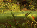
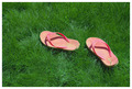
Anyway, here's an outtake I didn't use because the lawn wasn't as much the subject. Let me know, would you have voted it higher or lower?
Statistics
Place: 91 out of 152 Avg (all users): 5.1403 Avg (commenters): 5.0000 Avg (participants): 4.9153 Avg (non-participants): 5.2222 Views since voting: 926 Views during voting: 341 Votes: 221 Comments: 11 Favorites: 0
I like this photo and scored it pretty high. I prefer the color in this one more than in your outtake.
This probably got bumped down because it wasn't of a perfect green lawn, but the creative take on it is what made me like it. I wonder if some people didn't get it? The main subject may not be the grass, but the main subjects comment on the grass.
As below... there is lawn in the photo, but its not an important element visually. I don't see the image you entered as much more related to the topic than the outtake if that helps...
I do like the photo and "Abandoned" is a great title for it too. I'm sure it would have done better in another challenge...
It's kind of a cool looking shot, but I'm sure you were scored lower because the focus isn't really on the grass. I see the sign and the building. Without knowing that this was a grass challenge I never would have given the dead grass a second thought. I do still think it's kind of an interesting photo to look at though!
I think the lines are good, definitely an industrial feel, with a loss of a lawn. So I enjoyed the image for it's subject and message. The main problem...I don't know what to look at, as my eye wanders for something in focus. Finally the flash hurt the sign in that the shadow robbed you of DOF.
I think we suffered similar fates on our entries into the lawn challenge. I ended at 5.5. We didn't present the lawn as a standout subject and voters wanted that. I think the composition could be improved, the horizon below center doesn't do much for me as the details are all in the foreground, and the sky doesn't add to the composition that much. I may have cropped just above the big cloud on the right. The colors suit the industrial site well too.
Joe
I do like the outtake colors better actually....i'm glad that me commenting gave you at least one comment during the challenge! sorry if it wasn't very helpful. I like that you were more creative and thought outside the box.
This shot is the better of the two. The problem was that there were two subjest. The silo thing and then the sign. My eyes like the silo and are drawn to it rather than the sign. Oh well get em next time!
i really like this image as well, not sure why it wasent voted higher. the foreground and background are both used very well together. huh, voters are sometimes hard to understand
No lawn, man. No lawn, no love. I think you probably got beat up a bit for not having a typical lawn in the shot. Didn't vote in the challenge personally. I'm saving my votes for more exciting challenge ideas like 'roof' and 'driveway'.
I think what probably lost the voters was that the image is more of an industrial site (at least it looks like it) than a place for a lawn.
Ignoring the challenge:
It does give the sense of abandonment so you succeeded there though the composition has the horizon pretty much through the centre so it's very static.






 Add photograph to your favorites
 Add photographer to your favorites


 Photographer found comment helpful.


