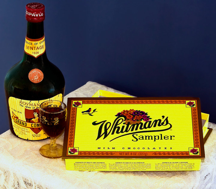
I think that this image is very oversaturated. I know what that candy box looks like and it is not that bright. That would be okay, if you wanted to brighten it, but there seem to be these little yellow dots on the table area and I think *overall* there is too much yellow. However, I DO like what you did with matching the colors of the box to the colors on the bottle. That is what I noticed first and I think it was very nicely done. So to sum up, I think the colors and color combination are good, just overall they are overpowering.
Seems like a lot of empty blue space in the upper right. Maybe if you taken this vertically and maybe cut off half the chocolate box and half the bottle, this would have been more interesting.





 Add photograph to your favorites
 Add photographer to your favorites

 Photographer found comment helpful.


