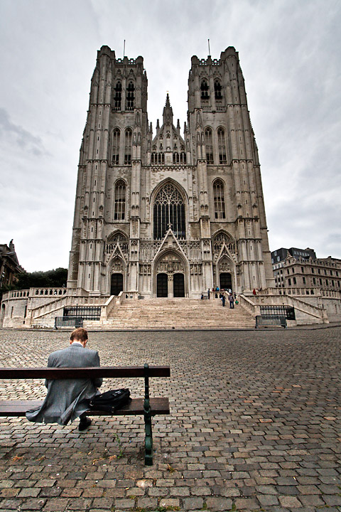
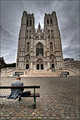
St Michaels in Brussels, Belgium. While walking across to get to the church, I noticed the guy on the bench, stopped in the middle of the road, and took a couple of shots. Had to move to avoid getting run over. Yet another shot with the 10-22, so I was almost right behind this guy. Good thing he didn't notice.
Lots of editing, including tonemapping the single original, then playing with that a bit more in Photoshop. I even cloned out a pole thingie.
Dream score - 6.3
Estimated score - 5.7
Post challenge:
Original and an alternate edit:
Score is good, but I would like to know if there is anything I could do to improve the picture (not necessarily how it would score, but the picture itself.) I trust it simply has no "wow", needed a more dramatic sky (see alt edit, maybe?) and really is just kinda plain and dull. Ah well. So am I. :-)
Statistics
Place: 108 out of 524 Avg (all users): 6.1307 Avg (commenters): 6.7500 Avg (participants): 6.1478 Avg (non-participants): 6.0789 Views since voting: 992 Views during voting: 237 Votes: 153 Comments: 20 Favorites: 2 (view)
Deb, I think this is terrific. I much prefer this over both alternative edits. Your composition, esp, catching the guy, is just spot-on.
Where it falls a little short for me is the sky, but even more the darkened tops of the towers. Tone mapping can darken areas it shouldn't, so I'd try it with two layers: tone map one, but then mask it so only the sky portion is showing, leaving the church fully bright. That'll help it stand out against the stormy sky.
That'd also free you to darken the sky a bit. Not a lot, and not as much as your alt. edit, but a bit. And I'd try just darkening it and increasing the contrast, not higher levels of tone mapping, to avoid the "halo" that appears near the church in the alt. edit.
But all of that is to suggest minor edits to a great shot.
Hey Deb - nice shot - see what I mean about commenters scores and non-commenters ? The ones who say it should do well generally mean it and score it accordingly . .
Anyway - the only thing I would have changed is the title, maybe to something like 'Contemplation' as he is sitting in front of a church with his head apparently bowed.
While you are right that this is a 'Bench with a view' the human element is not actually carrying out the suggestion in the title, which creates a slight distraction for me.
That aside - the both the technical composition, and included elements are very good - and as for the weather, or dramatic clouds - pfff - what can you do ?
Hi Deb -- For a DPC challenge, I think you may be right about the lack of "WOW", but then a lot of the time the weather in Brussels lacks "WOW" (cold and gray), and there's not much you can do about that! For me, the shot sort of tails off to dark at the top. I wonder if a more even light on the cathedral would help. Also, did you try this in b&w? Sometimes these shots on gray days (believe me, we have plenty of them where I live, as you well know) do a lot better in b&w than in color.
I really like it that you caught the guy on the bench. This becomes a very cerebral street photography shot.
What a fortuitous moment! I love how the guy on the bench is kind of balanced out by the people on the other side of the photo going up the stairs. Oh I see the other photo... going to that one now...
Deb! This photo is FABULOUS! I LOVE everything about it, from the stunning architecture and cobblestone street -- to the human element of the guy sitting on the bench. I love the lighting. I guess there were too many Icelandic skies to compete with to give it the score it truly deserved. Your commenters were much closer to what it should have been -- but even they fell short in my opinion!
Brussels ?
Good use of a very wide angle lens, I like the foreground globally (bench, lighting, slightwarm tone...) The sky could be a little more contrasted and/or dark IMO






 Add photograph to your favorites
 Add photographer to your favorites


 Photographer found comment helpful.


