CRITIQUE CLUB CRITIQUE
by karmat
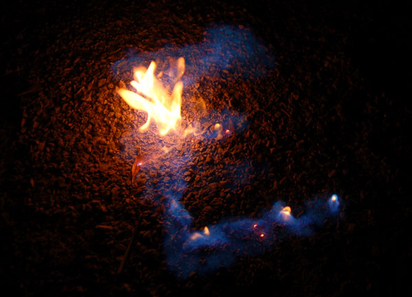
Interesting idea. I think if the background had been less textured, the "E" would have shown up better. Of course, it may have burned your background up, as well. :)
The focus and colors are good -- no major suggestions there.
The biggest thing I would look at is experimenting with crops. This one feels very centered, and leads it to seem static-y.
Perhaps the "E" in a corner with a lot of negative space would have been cool, or soemthing like that -- anything to draw attention to the fire.
A neat idea, though, and one that I think could really grow into something compelling and unique with some practice. |




 Add photograph to your favorites
 Add photographer to your favorites

 Photographer found comment helpful.


