Author Thread Comments Made During the Challenge
Post actions
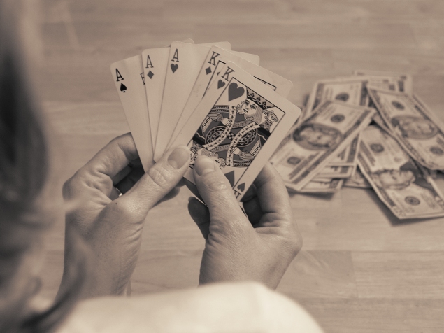
the head and shoulder in the foreground don't work for me, they are distracting
Post actions
Post actions
I'd rather used "PowerFULL" for the title. ;)
Post actions
I think your image would have been better with a little more contrast applied
Post actions
I like the composition, DOF, concept and point of view. Not entirely sold on the color treatment, however.
Post actions
nice lighting and setup. the contrast is really not up to par, though
Post actions
Not bad. More out of the box thinking. Good.
Post actions
Needs a bit more contrast, IMO. And saturation. Nice idea, though
Post actions
You’re betting that the other Ace isn't going to mate up with the other K, Q, J & 10... which sounds just like my family full of gamblers & bandits! I like the tone and DOF giving the blurred effect on the pot!
Post actions
Strong hand. The idea is ok and the technical performance is ok too. Maybe the cards needs a litle more sharpness and overal more contrast of the image.
Post actions
Post actions
Good idea, good toning, good shot. I just would either have cropped the head right out of the frame or added more of it. As it is it is kind of distracting somewhat.
Post actions
Post actions
Could be a little sharper, but this is such a unique idea for the challenge! 7
Post actions
The inclusion of the body takes away from the image. Wish i had that hand. Oh and also the cards being bent and dirty takes some points off.
Post actions
This image really stands out, sepia tones work really well. The shoulder and the hair distract however, and maybe the image should have been sharp on the king of hearts rather than the thumbs.
Post actions
I like the idea, but the lighting seems to flat.
Post actions
Post actions
Post actions
Good shot, but better without the hair as a distraction.
Post actions
Those aces aces are marked!!! And maybe one of the Kings too!!!






 Add photograph to your favorites
 Add photographer to your favorites


 Photographer found comment helpful.


