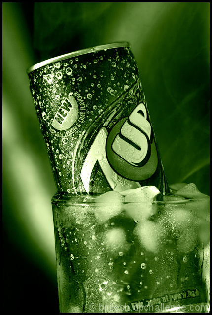
Thanks yanko for so detailed analysis. I found it very helpful. The main reason for choosing green tone just because I wanted to do different & not because the can was originally green.
This was actually one of my favourite shots during the challenge, I gave it a nine :) I agree with Yanko about the green not exactly conveying cold though. Maybe a Pepsi can would have worked better, either way I still love it. Nicely done!
Very nice light and tones in this photo. I'm surprised this got that many 3s but looking at the rest of the vote distribution it has a classic bell curve to it, which at DPC usually means "good shot" but lack wow factor. You almost have it here in the light and in the tones but a couple of things let you down. First the color, I understand the green connection with 7up but it doesn't help to convey coldness very well and since you're not shooting for that company but rather people who just want to see coldness a blue color would have been better. The other thing is there is a total lack of energy in the photo. When you look at beverage ads they almost always have movement, water splashes or at the very least drops of water on the can. That helps make the product more appealing and I think voters have come to expect that in these types of shots. Had you done that those 5 votes would have been 6s, 7s and 8s and you'd be seeing a much different score.





 Add photograph to your favorites
 Add photographer to your favorites

 Photographer found comment helpful.


