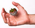
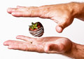
This isn't really my style, but I have decided to try and go outside my box and take pictures of things I am not comfortable with in an effort to become a more well rounded photographer.
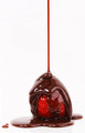
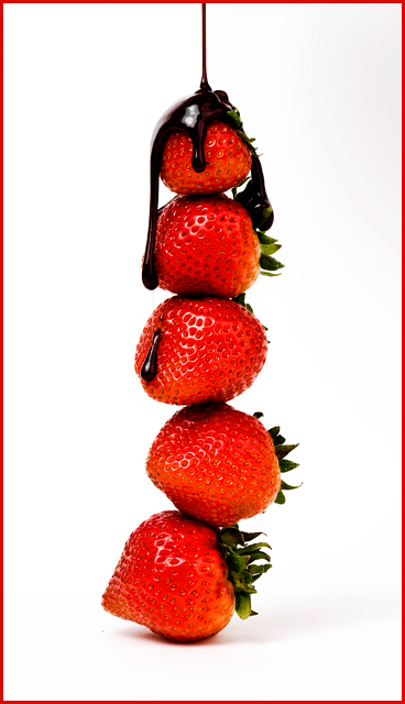
Not really sure how this will do because it isn't really an original idea, but I wanted to try... Oh... the top strawberry acted as an overhang and screwed up all the other pictures because it sent the chocolate straight to the bottom, so that is why you get this one!
*****POST RESULTS*****
Awesome! Thank you so much for the votes, comments, and ribbon!
Statistics
Place: 1 out of 134 Avg (all users): 7.1128 Avg (commenters): 8.3333 Avg (participants): 6.5000 Avg (non-participants): 7.3241 Views since voting: 10555 Views during voting: 388 Votes: 195 Comments: 33 Favorites: 10 (view)
Congratulations on the ribbon! I have to say though that the red in the strawberries is a little to intense. It looks like the contrast is a little to heavy. Also, the red border is not quite the right red, a little darker would be better.
Otherwise a really great shot!
The Tower of chocolate drenched Strawberries! Nice job on the lighting and love the sharp details on this one! The bright & bold reds of the strawberries really pop off nicely off the white backdrop. I also like the sheen that can be seen off the deep dark chocolate that is being poured over them. Years ago I found it challenging to photograph dark liquid chocolate for if you don't capture a sheen or an underlying hue of rich browns then it looks rather unappetizing. I can see both a sheen and some underlying tones of dark brown which greatly helps make the image more mouth-watering. Now on to two critiques that would help improve the visual impact of the photo. The arrangement of the strawberries in the tower has no real pattern such that they appear thrown together in a lopsided fashion. Arranging them in a pattern could help make the image even more appealing for the eye to look upon. For instance if they were arranged with their bases at the bottom with the tip facing up to met the next one at the base with the tip pointing up and so on. It would be a repeating pattern one which the eye could recognize and find order and appeal in it. Not to mention the top strawberry would have the tip pointing up such that the chocolate dripping down off of it would look similar to that of a snow capped mountain. Next I am none to sure about the choice of the red border - I feel that a border that is the same color as your main subject tends to draw away focus off of your main subject. A simple unassuming color to frame the photo would be more complimentry and not draw attention away.





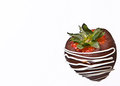
 Chocolate Covered Strawberries
 Add photograph to your favorites
 Add photographer to your favorites

 Photographer found comment helpful.