***My first DQ, ouch. I am severely disappointed in this DQ, in fact, I can't believe it. The DQ is for the "extra space" I added to the top of the frame via the black border, which is the same size as on the bottom, and which is just a matter of a few pixels, as you can tell from my original. The photo had the extra room. People use these types of borders all the time, I don't see how I unfairly manipulated my image given the original below.**
This is Kim, my reluctant model for a few of my entries.
I made margaritas:
6 Limes, thoroughly squeezed
~1 Cup Tequila
~1 Cup Triple Sec
Splash of Grapefruit Juice
2 Tbsp Sugar
Pour ingredients into mixer along with crushed ice, shake, serve into salt-rimmed glass, garnish with lime.
The Picture:
Taken in my front yard with a shaded tree as the background, with the evening sun coming shining through forming an intense corridor of light, which I asked my model to stand in. After that, just a little curves work to get the background black. De-sat all but the yellows: played with the desat tools to get this. A little S/H to get the contrast right. USM, s4w.
heres the original:
I really like this photo, I wonder what those 5 '1's are for :/
Disqualification Details
You may not use ANY editing tool to create new image area, objects or features (such as lens flare or motion) that didn't already exist in your original capture.
Statistics
Views since voting: 1871 Views during voting: 483 Comments: 26 Favorites: 5 (view)
I've sometimes done a black border like that which blended into the image area and then realized it was not "obviously a border". A nitpicky DQ for sure, but rules is rules, I suppose.
An excellent example of PP improving a so-so original image. Your adjustments really brought out some detail that was not obvious in the original.
I think if you had cropped slightly into her head then added the border it would show that it was an ACTUAL border... anal I know, but what can you do.
get back on the horse dude we have a tourney to win ;)
I think this is great and those five 1s are wacko. It's an excellent b/w considering you had to convert through selective colors, and it really does feel film noir. This photo definitely stands out from the crowd in this challenge. All I can say is, sorry some people are wacko.
Congratulation on your excellent picture - very elegant, unique and well presented. I cannot believe that it got 5 ones -some people must be crazy or blind.
So many times I came back to comment, then found I just couldn't string a meaningful sentence together. If there was one entry I would happily trade places with, it would be this. Classic elegance that really should be gracing the front page now.
The effective use of selective desaturation leads the viewers to focus on the main subject of this image. The directional lighting employed created a sparkle on the face further emphasizing the cocktail.
As to editing, considering the limitations imposed on the entrants, this went quite well. 7/10
I REALLY like your photo, but how did you do this in the rules of the Basic Editing? Never mind - I now understand, having read your comments, along with those of everyone else (how can you tell I am NOT PS-literate!). Love it, love it, love it.
Oh my god this such a great shot; my only nit-pick would be that the models eyes shouldn't be looking up into the light like that; they should be a bit more sultry and looking to the side or down: but that is an artistic point, all else is perfection.







 Add photograph to your favorites
 Add photographer to your favorites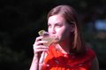


 Photographer found comment helpful.


