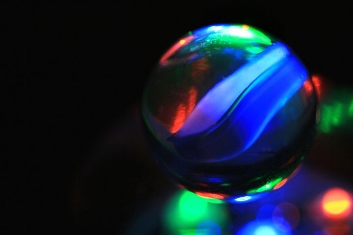
Browsing your portfolio I saw this and realized I am your 10 vote here so I am again obviously surprised at the final score. I just loved the colours and the composition. I think what I love is the glow of the reflections, really my kind of shot!
Color Saturation and Hue: Colors are very saturated in this image, but work well here.
Brightness and contrast: The white area at the top of the marble has reached burn out and is a little bit distracting. A little darker background might be good also. There is a faint out of focus area that shows up to the left of the marble. Were it gone, it could help the image.
Focus and depth of field: Focus is good, but depth of field feels a little bit short. The softness at the edges of the marble become pronunced at the top, due to all the color and brightness there. If the whole marble were sharper, I'd like it better.
Overall: I like this image alot. Feels sort of like stained glass. Keeping the LEDs in soft focus was a nice touch.
This is cool and is a great abstract shot, I really like it. I love the colours, the negative space and the composition. I think I would like to see something a little sharper on the marble maybe, though that could just be how the marble is! Colours are a little saturated but I like that as the black balances it out.
This is very very gorgeous. I love the dreamy feel. Maybe a tad oversaturated but I do think that the saturation helps have a good impact. I love the dark background as well - really sets off the colors.





 Add photograph to your favorites
 Add photographer to your favorites

 Photographer found comment helpful.


