Author Thread
Post actions
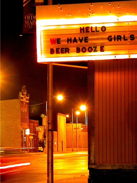
The extended exposure time helps to give a warmer feeling to the composition. Even though this is nightime the lighting makes you feel at ease.Not my type of hangout but this would make people want to visit.
Post actions
Interesting photo...great tie in with the title. Wasn't around to vote back then, but good emotive capture. :o)
Comments Made During the Challenge
Post actions
I think the photo is great, but the title is pretty retarded.
Post actions
i think this photo would have been even more powerful if you just shot the sign - i found this quite humorous - 7-photosbyayme
Post actions
Sounds like a nice place. I like the feel of the picture. 7
Post actions
Composition: Subject Placement, Cropping, Background8,
Post actions
I mostly like this shot and sorry, but I don't have the words to say what I don't like. The car whizzing by is great! The title - priceless! Focus/framing/lighting are all very good. (Maybe a patron entering this establishment?) 7 Swash
Post actions
Post actions
Post actions
I don't like this picture, because the lighting, buildings in the background, everything seems grainy and blurry.
Post actions
Picture would have been subtle and much better without you title. To titlelating of a title. You blew it there
Post actions
MasterCard came up with this idea...
Post actions
I suppose technically I shouldn't feel like I'm leaning. I like the orange colors. 7
Post actions
Very well shot and wonderful interpretation ~ Nitpick = I normally don't like the wordy titles, but your's works well... One change I would make to it would be... "Cover: $8, Drinks for Dancers: $18, Lap Dance: $20, Eternal damnation: Priceless!" But by any name, this is still a great shot!
Post actions
Composition: Subject Placement, Cropping, Background 5 , Technical: Focus, Exposure, Lighting, Processing 4 , Appeal: Is it Interesting, Motivating, Etc.? 4 , Total Averaged Rating 4. smshats
Post actions
This is good. Your photo tells the story.
Post actions
Great color - makes it sleezy looking
Post actions
Post actions
You help to cause the continuing decline of society by contributing to the sex industry.
Post actions
Maybe this shot would have been better in B&W ... orange colors remind me of poor video capture. The idea is OK but missing taht spark. 5/10
Post actions
The colors are very interesting and this shot has good placement. It would have been great if the shot included one of the female entertainers leaning up against the pole. Good for what you had to work with.
Post actions
The composition is okay, it seems a little bit tight to me, but hte yellowish cast distracts from the effect for me.
Post actions
Too orange, but the content is good. How did this one look in black and white?
Post actions
pretty well taken night shot. It looks a little extra yellow, but really pretty good. I like the sign too. Good shot.
Post actions
Good luck...you captured the mood here very well. Justine
Post actions
Good photo of a simple concept. Personally I think the title doesn't really work, but that's just me...
Post actions
Ah ah ah, great shot. I love night exposures, a nice brake-light streak would have been nice all along the street.






 Add photograph to your favorites
 Add photographer to your favorites


