Author Thread
Post actions
thanks to everyone for your comments. I learn alot from your input.
Comments Made During the Challenge
Post actions
only 96k utilised - the quality factor could have been increased by another 50% upto the 150k maximun
Post actions
Composition: Subject Placement, Cropping, Background7,
Post actions
great composition and shot...the message is very clear.
Post actions
Good composition, the graininess adds to it.
Post actions
Composition: Subject Placement, Cropping, Background 7, Technical: Focus, Exposure, Lighting, Processing 5 , Appeal: Is it Interesting, Motivating, Etc.? 5 , Total Averaged Rating 6 . smshats
Post actions
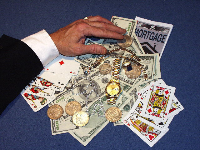
Very good idea. The guys shirt tells me he has won many times.
Post actions
For some reason the picture does not appear very sharp
Post actions
sharpened a little too much
Post actions
Is that a pinochle deck? I do like the shot btw.
Post actions
I like this. I like that the bet on the table included somebody's house and watch . . .not just cash. You obviously put a lot of thought into the concept and your time and effort shows in the finished product. Very nice.
Post actions
I like the concept of the photo, but think the lighting is a bit off.
Post actions
Nicely done, and it fits the theme well too. 7/10
Post actions
Good color mixture and use of materials. Very crispand clear photo
Post actions
What an original great idea for a photo. Would love for u to have set up some other players and get partial parts of their cards but a beautiful shot 7 Mags Coyote
Post actions
The hand looks like its at a strange angle.
Post actions
interesting idea but the set up looks a bit too "set up"
Post actions
Post actions
Reminds me of an album cover, but can't remember whose (Blue Oyster cult perhaps?)
Post actions
Dang! Don't you have a lotta dough handy for just a pic... Ok shot, but it would have been more effective with other players involved.
Post actions
A bit unoriginal, yet well executed shot. It's a bit static though and the framing could be less centered and a bit closer to add to the composition. Nice effort. 6/10
Post actions
The focus seems a little off to me, but that may be my monitor. I like the contrast of the colors on the blue background. The hand looks "staged" to me, not a natural position, but I understand that it may jsut be the perspective. karmat
Post actions
Just way to blatant of a statement and it is too pedestrian of an effort to make it work.
Post actions
Silver dollars. Nice shot, good title too. Good luck-Justine






 Add photograph to your favorites
 Add photographer to your favorites


