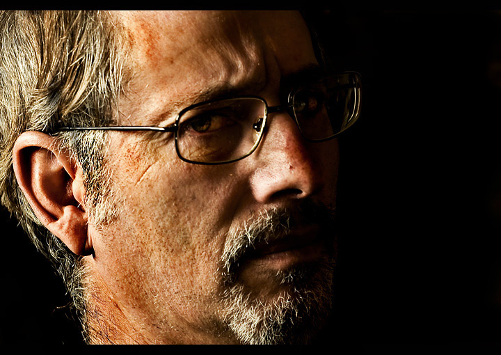
Took a portrait of my Dad who had an interesting texture to his face :P I tried to make it look as grunge as possible, not really sure how this will do.
For this shot I used natural light coming from the window.
Post-processing:
Levels
Contrast
Multiply on Blending Mode and adjusted opacity
Dodge and Burning
Layer Masks
Curves
Desaturate slightly
Statistics
Place: 151 out of 247 Avg (all users): 5.5283 Avg (commenters): 7.0000 Avg (participants): 5.2911 Avg (non-participants): 5.7625 Views since voting: 1080 Views during voting: 256 Votes: 159 Comments: 9 Favorites: 0
Before I get to this photo, it's important to realize that when it comes to the challenges, voters expect a high degree of technical prowess to be seen upon first impression. They require that your lens produces great sharpness, your light is directional/raking and that there is good detail throughout the tonal range (highlights, midtones and shadows) and it also doesn't hurt to show a unique POV/composition. If you are weak in those areas then it is very hard to receive a very good score even if your content/story or idea is fantastic.
In light of that lets look at this photo.
Composition - The first thing that I notice is the subject is a bit too centered. That POV is too common to win you points more likely it will subtract points. The cropped head is ok at the top but on the left side it's a little too close to the edge of his head which is not where you want to crop. If you crop a head make it a good size crop. So in this case you would crop more from the left or don't crop his head at all.
Lighting - I like that it produces a mood which you recognized given the title you chose. Where it fails is in it's intensity. It's too bright in the area around from his cheek to the back of his head/ear. That being the case my eyes want to go to his ear first rather than his eye which is where you want the focus. So if this was my photo I would tone down the light intensity/fall off area so that his ear would start to fade into shadow rather than be as bright as it is. If that makes sense.
PP - I like the look. You executed the grunge well without going over board.
Overall, a good photo. It's got a mood and vibe to it but just needs a little more wow for the challenges.
only thing i would have liked seen is his eye in a little more light, just so we could tell his mood better. love the half cast in shadow, and the otehr half grunge like, very good detail in his face.
I really like this portrait and feel that it's underrated scorewise. I'm no expert on portraits but I think americandream nailed it in saying the eyes should have been brighter. It would have made a BIG difference to the overall effect. Still very good work and your Dad's very photogenic.
very good picture! the lighting helps contrast to the entire face, but I personally would have made the eyes a little brighter and a little bit more in focus than the back of the head. then the picture would have given a personal effect as though he is looking straight towards someone.






 Add photograph to your favorites
 Add photographer to your favorites


 Photographer found comment helpful.


