Author Thread
Post actions
Grrrrr.... Arrrrggggg....
Post actions
Comments Made During the Challenge
Post actions
Post actions
Post actions
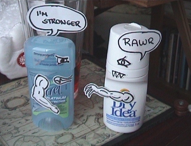
A little grainy and there's a lot of activity in the background, but funny. You ought to try selling this idea to those deoderant companies. 7
Post actions
You so silly! Cute idea. You get an 9 on GP.
Post actions
Funny background should be eliminated and clean leaving the subject to speak for itself.
Post actions
i think you should have put the two subjects on a white background and used a high wattage bulb to light them-this would eliminate the blurriness and the business of the shot.
Post actions
Image seems about out of focus or oversharpened or something (pixilated), but there's a lot of creative effort here that gets you extra credit.
Post actions
Hehe, someone had some free time eh?
Post actions
Post actions
creaative but not that good
Post actions
Post actions
8 for being original...but the quality and overall appeal..ummm not so high
Post actions
funny idea...but the photo could have less distractions and show more technique
Post actions
very fun and original idea. you might have used a less distracting backdrop however.
Post actions
Post actions
i'm glad to see someone on this site has a sense of humor. i love it!
Post actions
This is hilarious! If only the image quality and final composition matched the effort put into doctoring the deodrants!
Post actions
poor quality picture - blurry, grainy. the background is distracting and unrelated, the surface on which they sit is also distracting. Check the rules regarding artwork (the parts you drew are artwork!)
Post actions
Post actions
This image is heavily pixelated. There is a lot of image noise. I'm wondering if you need to try something different with lighting. It looks like you shot this in a dark place. Maybe next time you could try shooting outside, but with an all-white or all-black background (even construction paper would work or a sheet) THe idea is good though and it made me laugh. - 5.
Post actions
An extra point for the humor. Keep it up.
Post actions
Post actions
Post actions
Funny, but not actually very good as a picture. Too grainy, not focussed too good. But, as I said, it made me chuckle, which alwaus helps (5)
Post actions
this picture rules. i voted really high on it even before i checked my email. then i found out it was yours!! good job, i really like it ! 8) " this gets a 10"
Post actions
It would have looked better if it was in focus. The background is distracting, I would suggest using white sheet or a white piece of paper as a background :)





 Add photograph to your favorites
 Add photographer to your favorites

 Photographer found comment helpful.


