Think it´s no doubt that people can find strength and power in relegion so the idea is ok. But I think you could have performed this better technically and also with more creativity.
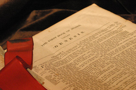
I like the lighting conditions, but this did not strike me as a very original composition. The viewers knowledge of this particular book is what holds it, instead of it's visual aspects.
I do not know if the page was suppose to be white, but with the age marks on it I would doubt it (no impact on scoring), but the page would have looked better without the creases.
Be careful with your spelling in the title, "In the Beginning" Maybe a title like "Power to Speak the Universe into Existence" would make the tie closer to the theme, instead of having to figure it out. The crease in the page as well as the lack of sharpness in the words hurts the photo IMO.
I kinda-sorta see where you are coming from, but I can't stand the fact that people seem to have to use religious themes every bloody entry. Besides, the actual picture conveys no strength at all - it is the book in the picture. So on a challenge named "funny", I could include a DVD cover of The Mask? I don't think so. SOrry, don't like it. (1)





 Add photograph to your favorites
 Add photographer to your favorites


 Photographer found comment helpful.


