Got this idea as soon as I saw the challenge, but took me all week to finally get off my butt and do it. Been awhile since I actually shot an image specifically for a challenge. Hope people like it.
Edit:
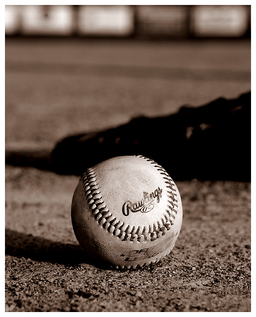
Crop, adjust exposure, convert to B&W, convert to sepia, brightness/contrast, USM, resize, border.
Statistics
Place: 101 out of 267 Avg (all users): 5.5000 Avg (commenters): 8.4000 Avg (participants): 5.3692 Avg (non-participants): 5.5859 Views since voting: 914 Views during voting: 248 Votes: 164 Comments: 8 Favorites: 0
Color, Saturation, and Hue: N/A Image is monotone (Sepia)
Brightness and contrast: Both are very good, though right at their limit. Detail is starting to dissapear right below and to the right of the Rawlings logo.
Focus and depth of field: Focus is nice and sharp, depth of field is appropriate for this image.
Very nice compostition. I could see this hanging in a clubhouse or restaurant at a ball park. I like what looks like a shadowed glove in the background, and what appears to be signs along the outfield fence.
The biggest thing I see that hurt your score is that there was probably a fair number of people that didn't see the weathering in this image. The ball looks a little scuffed, but not old. A tattered old baseball would have worked better for me here.
Still though, a very good image with a lot of potential, and in another challenge would have scored much higher.






 Add photograph to your favorites
 Add photographer to your favorites

 Photographer found comment helpful.


