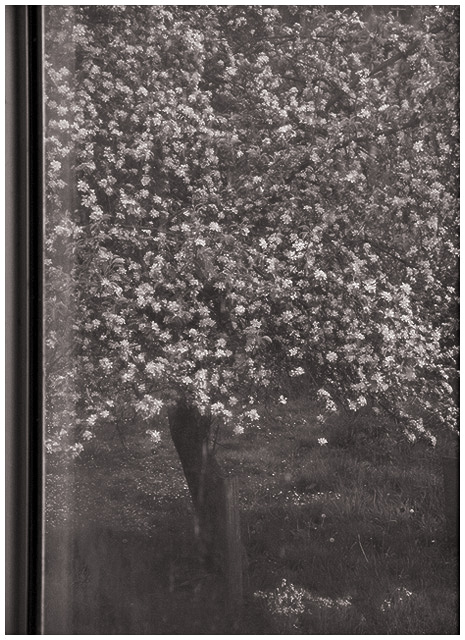
I decided to leave the window dirty for this picture because the frame was simply too ugly to leave in... I cropped a bit of it out, but you can still see the awful metal edges. This tree is out in the back yard and it looks so pretty in the spring.
I did quite a bit of editing on this one. There was some junk piled in my neighbour's yard, so I cloned it out and did some dodging and burning for blending. The photo was originally in colour and I decided to convert it to b&w and add some slight pinkish colouring; I also rotated and, as I said, cropped some of the nasty window frame out. I wanted to leave some of it, though, in case the glass wasn't obvious enough, which it should be. Curves and levels were also tweaked, and I did some sharpening with fading.
I had a difficult time with this, as all of my favourite window pictures ended up not showing the glass obviously enough and didn't include the frame.
Statistics
Place: 104 out of 135 Avg (all users): 4.9878 Avg (commenters): 5.2500 Avg (participants): 4.8795 Avg (non-participants): 5.0988 Views since voting: 1115 Votes: 164 Comments: 10 Favorites: 1 (view)
Thanks Jason and the [few] others who understood my intentions with this photo. :) I wasn't expecting a great score, but I'm a little disappointed that it didn't break 5. I guess old fashioned is not the way to go here.
It's a beautiful tree, but the window reflections distract a lot from the impact of the photo. Maybe increasing the contrast would help. I'm not convinced that B&W is an improvement, blossom should be colorful IMO.
There's just not enough contrast to jump out at you. Maybe the color version would have had more character? Spring is so full of color that it just seems odd in B&W




 Add photograph to your favorites
 Add photographer to your favorites


 Photographer found comment helpful.


