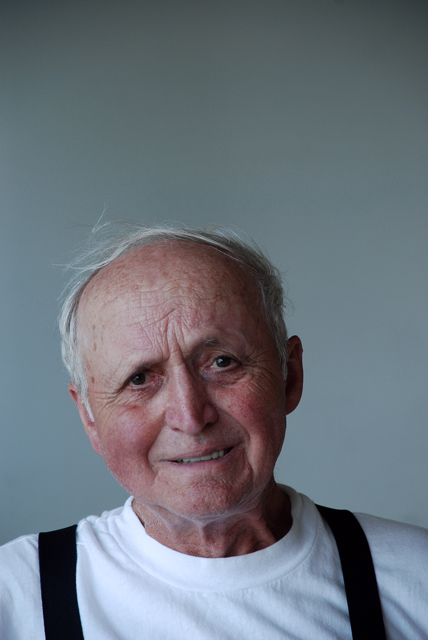
This is a wonderful engaging refreshing portrayal. The expression and lighting and framing which make the composition (lines, shapes, spaces) work extremely and subtly well.
This should have placed much higher. The composition is strange with so much room above his head (which is why I assume this placed so low), but I don't think it would have worked nearly as well had you used traditional composition. I like this shot a lot.
I had given this a 7. A tighter crop and maybe some additional processing (sharpen, NI?) would have improved bit, I think. I wonder how it would look in black and white?
I wish you had cropped more of the top so I could better see grandpa's face (better use of space) but, I think the lighting you used enhanced the texture of the subject. well done





 Add photograph to your favorites
 Add photographer to your favorites

 Photographer found comment helpful.


