I didn't get a chance to comment but this is an amazing window shot! The shadow of the person breaks the symetry and keeps your eye on the photo. I'm not a big fan of green tints but I don't find it distracting here. Great job! My top of the challenge! :-)
I'm so happy for you. This is one of the most thought provoking pictures I've seen on this site. Good job on a well deserved ribbon. My vote got stripped but it was a 9.
Thanks for the comments and critique. ohh how frustrating to be so close to my first ribbon but not close enough :D. This was shot through the nice old doors in the Thorvaldson building at the university of Saskatchewan here
THis is no offence to the people who did get a ribbon, but I'm shocked that this one didn't edge in just high enough for one. Congrats on the high placement though. Well deserved!
Really great composition, off-centering the person. I like the idea, I think its very original. B&W would have looked better than the yellow tone. The white line in the border is too thick though. Its still a nice photo.
Intriguing shot, possibly looks a little too 'NeatImaged' for me. Well exposed, bearing in mind the extremes of tones. I like the blurred figure. Atmospheric choice of colour. Effective composition.
Very beautiful and well done. I love the yellow and black/brown tones and the alignment of the doorway/archway with the image frame. Borders are very good as well.
Nicely composed and exposed, and te broken up silhouette helps to relieve the symmetry. One minor thiong - I think it could do with rotating a touch to the left to straighten out the top of the door frame. (9)
I've been looking at this for about 15 minutes because it has so many different meanings. Is the viewer inside and denying entry to the person outside? Is the figure in the picture denying entry to everyone else? Light and dark. Good job!





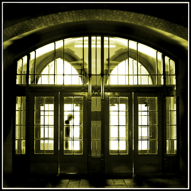
 Denied Entry
 Add photograph to your favorites
 Add photographer to your favorites


 Photographer found comment helpful.


