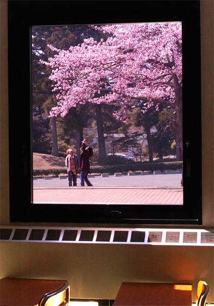
Personal opinion here. The top third of the pic is excellent. With the window frame, this looks like a picture hung on the wall. With the lower 3rd, this starts to look strange. Kinda like it doesn't belong. Maybe you included because you wanted to prove this was taken from a window in a class room? I think we would have believed you with just the window frame. The uneven lighting in the room is distracting, and pulls from the key subject area. A tighter crop would have scored you much higher. Best ~ d
An interesting idea, and a nicely balanced exposure. I find the slope of the top of the window a little distracting, and there is too much foreground for my taste.






 Add photograph to your favorites
 Add photographer to your favorites


 Photographer found comment helpful.


