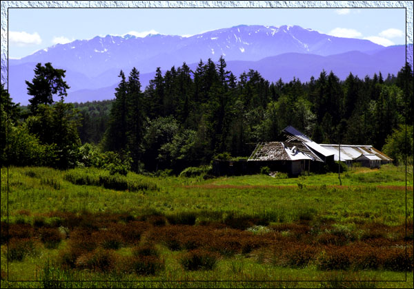
Not liking the border...presentation is part of the overall effect and all I want to look at is the upper edge. Not that a border doesn't add something, but not this one on this shot.
(And that is the only thing that I don't like, so nice job.)
Nice image. The shadows seem a bit too dark, but the colors look nice and natural. Not at all over saturated as several other images in this challenge are. I like that you didn't try to over do it in your pp. I'd get rid of the frame though as it doesn't compliment the scenerey at all.





 Add photograph to your favorites
 Add photographer to your favorites


