Author Thread Comments Made During the Challenge
Post actions
Image to small to really critique. Seems a bit out of focus from what I can see. Wish you well in the challenge.
Post actions
Believe it always makes sense to use the allowed 640 pixels.
Post actions
Post actions
Nice idea but the stuff in the bacground is a bit distracting.
Post actions
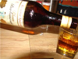
Would have had a stronger impact if the image had been larger. Next time try diffusing your main light. The highlights on the bottle are washed out and the shadows are harsh.
Post actions
harsh lighting, the shadow at the bottom is also distracting, composition could be improved.
Post actions
Small picture, tilted view, harsh lighting and shadows. Seems like you're aiming for brown here.
Post actions
Post actions
The shadow in the foreground is distracting.
Post actions
Photo could do with being bigger. Composition is poor and lacks interest. Sorry.
Post actions
bottle out of focus, but good idea.........
Post actions
Good image and title. Why so small?





 Add photograph to your favorites
 Add photographer to your favorites


