Critique Club Review:
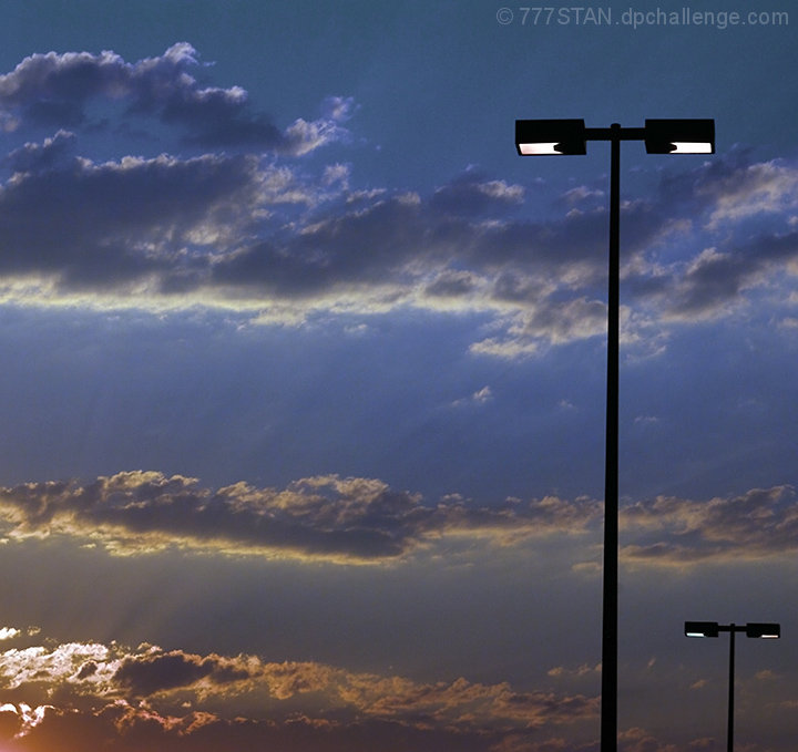
Color Saturationa and Hue: Colors and saturation are very nice. Hues are believeable.
Brightness and contrast are good.
Focus and depth of field are very good.
I think the problem here is you have this really nice sunset(?) photo, with light poles in the way. The rays of light grabb the eye and pull it down to the lower left corner, all the while fighting the light poles. End result two subjects, one picture.
The light poles sort of pop out of nowhere, and look a bit tilted. The litteralists also probably voted you down a bit because there were two light poles rather than one. (Oh yes, it does happen.)
As this is an advanced edtiting challenge, I would like to see this picture done without the light poles, and then one of the sun's rays highlited for that single line. |





 Add photograph to your favorites
 Add photographer to your favorites

 Photographer found comment helpful.


