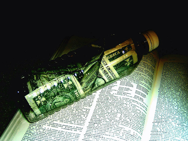
Interesting concept, but I don't like the lighting. And you can barely tell what is on the book unless you look really closely - I think it's trying to cram too much into one picture. Perhaps just focus on the bottle with the money and use a different type of lighting.
I don't think this is a very clear message of strength. To me, the bottle is unappealing....just a used soda bottle? The use of text in the background doesn't seem to make sense to me and it's not clearly in focus, so it's hard to read.
Actually, lately, this is softness in a bottle when compared to most free floating currencies, but close enough. This could stand to be a little sharper, but is certainly on the right track.






 Add photograph to your favorites
 Add photographer to your favorites


