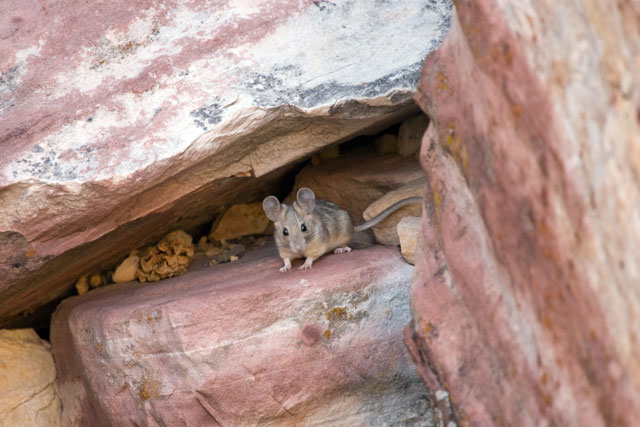
As I sat on a rock some 25ft or so from this little guy he was checking me out for some 20 mins. The title Safety First I hope makes the connection to prudence with all of you. I fought myself over cropping the right side of the image but tho it would take away from how protected he was.
Contrast
usm
curves
tone
resized for web
Statistics
Place: 65 out of 83 Avg (all users): 4.8105 Avg (commenters): 4.6667 Avg (participants): 4.5000 Avg (non-participants): 4.8882 Views since voting: 1419 Views during voting: 335 Votes: 190 Comments: 12 Favorites: 0
Color Saturation & Hue: Colors are well done. Nothing is over or under staturated. Tones appear normal for the subject.
Brightness and Contrast: The white on the rock above the mouse is blown out and featureless. I would imagine that this is a result of trying to keep details in the shadows behind the mouse. All in all it is a good tonal range, but comes out looking a bit pale overall due to the white areas and large naturally pale areas. (Not a process in fault, just the way the composition comes across.)
Focus and depth of field: Focus is nice and sharp but maybe a little long, and depth of field appears a bit shallow. You did a nice job of softening the rock on the right, to force the attention towards the mouse. However, the sharpest area is the debris to the left of the mouse, and that is where the eye goes. Your best bet, besides correcting the focus, would have been to crop the rock on the right out of the picture. As it is, the mouse is dead center which violates the rule of thirds. While it is not an ironclad rule, some techies vote like it is.
Still, all in all a reasonably good picture. I think another reason your image did not do better is seen in some of the comments. They just didn't see a mouse as a virtue. Although you were trying to show caution or attention to safety in your image, as a virtue (which it is), I believe that too many voters just saw a mouse. Which is unfortunate.





 Add photograph to your favorites
 Add photographer to your favorites

 Photographer found comment helpful.


