|
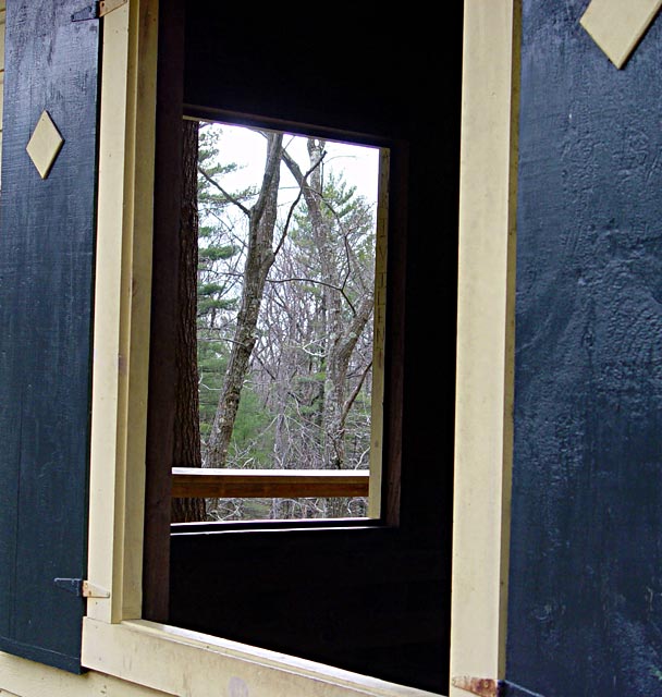
Nice find - and the" two for one" title is catchy. To me, the overall photo lacks impact - mostly because the end view through window #2 is pretty busy and doesn't reall have a "subject." There's also some composition issue such as the "border areas:" 1) The slim area on the very top left of the frame should be eliminated, 2) The white board in the top right of the frame leads you out of the frame (And since we should probably see more of the bottom of window #1 - maybe just moving the camera down a bit would be the thing to do.). Finally - it would be helpful if there were some texture in the area inside the building. Was there a way to get some light reflected in there? I know this is a lot of info - but hope it heps. |






 Add photograph to your favorites
 Add photographer to your favorites


 Photographer found comment helpful.


