| Author | Thread |
|
|
06/27/2008 05:51:21 PM |
Critique Club Review:
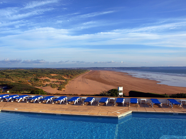
Color Saturation and Hue: Excellenty done! I love the colors in this image. The blues really tie the image together, and the chairs really pop.
Brightness and contrast are very good.
Focus is very good. Nice sharp photo.
I wish this were an advanced editing challenge, cloning out the white tower would be helpful.
The biggest problem I see is that you have two major elements fighting. I like the contrast of the regimentaion "everybody get in line" of the resort, and the free form of nature behind it. But you have two major leading lines fighting to the death here. The chairs and the wall lead the eye towards the left of the frame. The tower grabs the eye then the patterns on the beach and the vegetaion try to make the eye go to the top of the frame. At this point the pop of the chairs hurts the picture as they try to pull the eye back.
This winds up being really two pictures in one, eternally fighting for attention.
|
|
Comments Made During the Challenge  |
|
|
06/23/2008 10:48:25 PM |
|
NIce blues. I dont see any successful people there.:)Would have been good with a human element thrown in. |
|
|
|
06/21/2008 10:33:25 AM |
Why? A tourist resort blemishing a vulnerable dune landscape - not my idea of success. An empty pool and a row of empty deck chairs - hardly what the hotel management would consider a success. Ah, I know, from the tourist's point of view - being out before the German visitors have reserved all the chairs must feel like a success...;)
There is not much elevating the image above an average snap shot, I'm afraid. |
|
|
|
06/20/2008 06:54:27 PM |
|
Wow. That's a GREAT view of success! 8 |
|
|
|
06/20/2008 02:57:50 PM |
|
very nice contrast between the blue sky and the pool. It seems like the blue chairs ties it all in together. Is this depicting success as having your own remote beach and pool? |
|
|
|
06/20/2008 12:51:31 PM |
|
Terrific shot and perfect for the challenge. As a post challenge improvement, I would remove the white tower in the center and the white sign on the left. |
|
Theme:
Classic /
Light /
Dark
Home -
Challenges -
Community -
League -
Photos -
Cameras -
Lenses -
Learn -
Help -
Terms of Use -
Privacy -
Top ^
DPChallenge, and website content and design, Copyright © 2001-2026 Challenging Technologies, LLC.
All digital photo copyrights belong to the photographers and may not be used without permission.
Current Server Time: 10/17/2026 10:14:40 AM EDT.






 Add photograph to your favorites
 Add photographer to your favorites


