Critique Club Review:
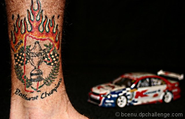
Color Saturation and Hue are all good. Brightness and contrast are also good. Skin tones are well done, and look very realistic.
The car distracts from the picture. I try to look at the tatoo, but the eye is consistently pulled away. Even though the car is soft, all the negative space winds up highlighting the car. The leg almost becomes the frame of the picture, which further pushes the attention to the out of focus car.
The tatoo is cut off at the top of the picture, and the foot cut off at the bottom. I would like to have seen the tatoo more in context. Thing that come to mind, are a photo at the track, or perhaps all the team members tatoos repeated across the image next to each other.
Congratulations on back to back wins, that wasn't easy. |






 Add photograph to your favorites
 Add photographer to your favorites


 Photographer found comment helpful.


