Critique Club Review:
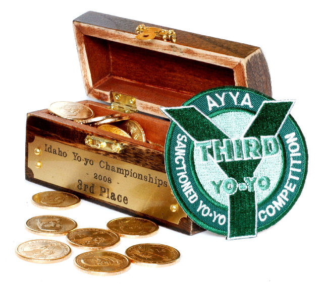
Color Saturation and Hue: Colors are realistic and not over-saturated. Brightness and contrast: Details are held in the shadows, one small area is at burn-out and loses some detail in the coin at the left edge of the box interior. However,the background appears featureless and bright. It winds up competing with the subject by its brightness alone.
The picture does tell a compete story, but the patch competes with the chest, and both attempt to tell the same story.
The image appears to be a bit overprocessed. The edge on the patch is so hard, that it almost appears to have been photoshopped in. |







 Add photograph to your favorites
 Add photographer to your favorites


