Color Saturation and Hue are well done. Brightness and contrast are good as well. Focus and depth of field are very good.
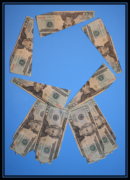
It took me a minute to figure out what this was. At first I was thinking necktie. Interesting commentary, and nice idea. I think that as others noted, keeping the edges together would have worked better. Also the background competes with the money, making it look almost drab by comparison.
Had the center been filled in, or had this been uses as a ribbon on some object, I think the photo would been more powerful for me.
Overall and interesting image with potential for further development.
LOL too funny, your missing one bill in the circle, the space at the bottom of the circle is a touching and the others don’t, the bottom right ribbon tail should be on top. Money and time well wasted LOL I looked at this pic way too long. Good luck! My title for this is "CASH PRIZE" the bills look funny too but im Canadian!






 Add photograph to your favorites
 Add photographer to your favorites

 Photographer found comment helpful.


