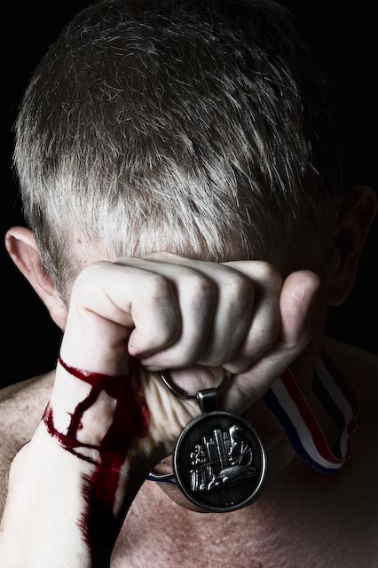
Sorry for the random comment, must have happened while browsing during voting. I think this is a really great idea. The cropping is perfect and the pose is great. I'm being a bit picky here, but the blood stood out to me as looking unnatural. It might be the color, but I think it's that it isn't flowing in a natural way. If this had been advanced editing, I wonder how it would look with selective desaturation. Maybe only leaving the blood and the medal in color, or just the blood. Great take on the challenge :)
Message edited by author 2008-06-25 04:03:34. |





 Add photograph to your favorites
 Add photographer to your favorites


