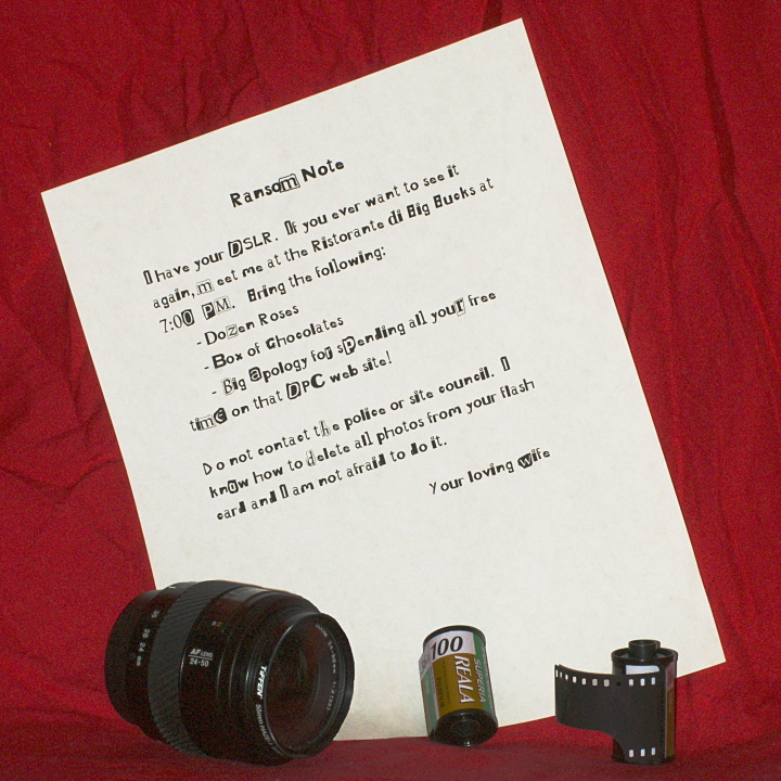
Just thought I'd have some fun with the challenge. I download 3-4 Ransom fonts and was not real happy with any of them. This is a combination of two of them.
By the way, my wife is very supportive of my photography, so this has no basis at all in truth.
PP in Gimp
Crop Square
Curves
Clone/Heal Dust and minor shadows
Dodge/Burn
USM
*******************
Thanks for all the comments. This was my first attempt at a crude studio and I was having trouble with the lighting hence the ISO 400 and all the grain. I have solved the problems and will not do that again! The film was an attempt to show different photography items as clutter in the foreground. I still shoot film occasionally but I guess most DPC'ers do not and found the digital/analog mix at odds with each other. Point taken.
Statistics
Place: 35 out of 62 Avg (all users): 5.3866 Avg (commenters): 5.8182 Avg (participants): 4.5758 Avg (non-participants): 5.5528 Views since voting: 1336 Views during voting: 530 Votes: 194 Comments: 27 Favorites: 0
humor definitely scores you some points.... the image is super noisy though, did you maybe not have very much light? by your lens are you shooting w/ a sony? (that looks like a minolta maxxum lens)
First off I love the concept! The actual photo has noise/grainy or both. Maybe to high on your ISO? I don't know specifically but thats what I see, I do love the ransom letter. Laid out perfectly, and if I may say so.....Very Appropriate. So kudos!!
Seems to me like you better be there with TWO! dozen roses!Great Idea however there is Lots of noise in the picture and the film doesnt quite fit as its a DSLR






 Add photograph to your favorites
 Add photographer to your favorites

 Photographer found comment helpful.


