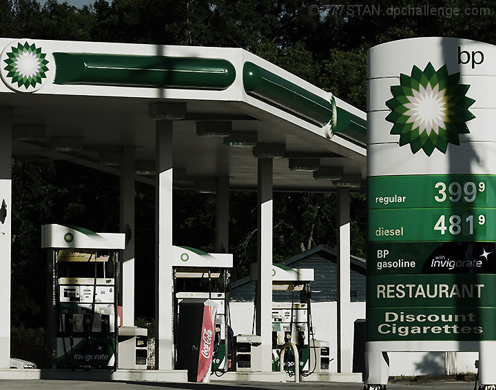
Reason I chose this photo for entry: Though Europe and the rest of the world has been experiencing the "Highway Robbery" of gasoline price-gouging (IMHO) for many years now, it is still a relatively new experience here in The States. It feels like criminal activity that is government sanctioned.
I seem to remember a little "Temper Tantrum" we had a couple centuries ago in Boston Harbor when The Crown was over-pricing our tea shipments...Can I get a witness from The Commonwealth? :)
Statistics
Place: 54 out of 62 Avg (all users): 4.7526 Avg (commenters): 3.7500 Avg (participants): 3.7714 Avg (non-participants): 4.9742 Views since voting: 1087 Views during voting: 469 Votes: 190 Comments: 17 Favorites: 0
Compositionally, it is good that the sign with the prices "anchors" the shot on the right. I assume that is your focal point. The eaves of the "shelter" over the pumps also serve as a kind of leading line pointing you to the sign. The price sign is straight, but the perspective of the the rest of the shot leads it feeling a bit tilted to the right. I'm wondering if a different angle would take advantage of the "patterns" created by the tanks, and minimize the actual price. That way, you would still get your idea across, but in a more generic way (those with higher prices wouldn't be distracted by your lower ones, etc). Or you could have tried to simplify the shot and not include quite so many elements of the station.
Technically, I like the high contrast and the fact that you resisted the urge to super-saturate the greens, as some are in the manner of doing. The deeper hues gives it a more serious, heavy feeling. The focus seems pretty good, and clear, especially on the sign and falling off some on the rest of the shot. On the one hand, this further directs attention to the sign, but on the other, it can give the impression that focus isn't as clear as it could be. Also, the lighting is extremely harsh on this. I think it would work, generally, to further the mood of your shot, but that shadow down the middle of the sign on the right is really distracting.
Overall, a decent shot that meets the challenge in a political statement kind of way.
This is good. I was going to do the same shot. I think it would have been more effective if the attention was drawn to the prices. My eye wanders over the entire picture.






 Add photograph to your favorites
 Add photographer to your favorites

 Photographer found comment helpful.


