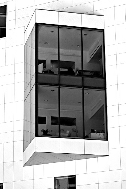
Color Saturation and Hue: N/A Brightness and Contrast: A high contrast image, with the white of the building at burn-out levels.
The featurless white against the grid lines of the tiles makes for a interesting image. Unfortunately it also draws immediate attention to the fact that the camera was not level when the image was taken. This can be corrected in post processing by rotation and cropping.
The other problem is that the partial windows jutting in from the edge of the frame, compete for the attention of the viewer. A tighter crop would have corrected this issue.
As is, this image has nice strong bones. I'd like to see it with a tighter crop, and a correction to the horizon and perspective. Fix the problems and I think this could have made the top 10 or certainly top 20. This would be an excellent image for a high contrast challenge, and could score even higher there.
Cool, with these "window boxes" there can be many more corner offices than just the four corners of the building. Nice image. I like the geometry and lines.






 Add photograph to your favorites
 Add photographer to your favorites

 Photographer found comment helpful.


