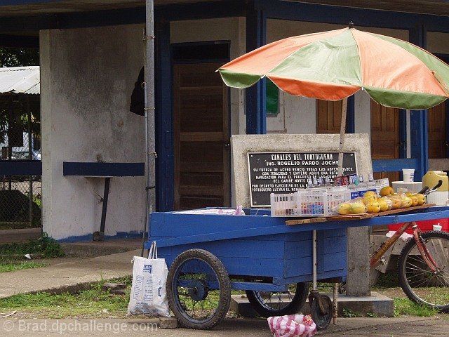
During a recent trip to Costa Rica, this cart, the colors and lack of an attendant caught my eye. Shot from a moving vehicle tossed a challenge all in itself.
Life is a little slower in the Caribbean it seems.
Statistics
Place: 206 out of 283 Avg (all users): 4.7362 Avg (commenters): 5.6250 Avg (participants): 4.7966 Avg (non-participants): 4.6838 Views since voting: 1945 Votes: 254 Comments: 13 Favorites: 0
I appologize for not seeing this earlier. "Colors and focus appear to be good. Personally, I would like to see the colors pop just a tiny bit more...with some brightness, but that's really a matter of opinion.
I think the biggest change that would benefit this subject is a different angle of composition. Because the subject is "wheels", it seems odd to crop the shot so that the bicycle wheel is cut off. I agree with some of the others who have mentioned cropping out the left side of the shot. I would have liked the angle better taken more from the left side of the cart and looking down past the cart some to the right; and possibly a little closer to the cart as well. A different angle might also help by lessening the attention (focus) on the sign behind the cart." I have another version on my PC that I like much better. I did do some adjustments and cropping, and have since learned about USM. As this was my first submission, I uploaded it essentially as it came out of the camera, and assumed that the challenges should be just that. Anyone can manipulate. Software shouldn't make the shot - the photographer's eye and his equipment should. "Considering it was taken from a moving vehicle, I'm impressed with the clarity of the shot." You aren't the only one. This shot still does something for me.
I like the fact that your subject is something you "found" and not a "set up". I'm not against a set up shot, but I do think finding an image as you have adds something to the photo.
Colors and focus appear to be good. Personally, I would like to see the colors pop just a tiny bit more...with some brightness, but that's really a matter of opinion.
I think the biggest change that would benefit this subject is a different angle of composition. Because the subject is "wheels", it seems odd to crop the shot so that the bicycle wheel is cut off. I agree with some of the others who have mentioned cropping out the left side of the shot. I would have liked the angle better taken more from the left side of the cart and looking down past the cart some to the right; and possibly a little closer to the cart as well. A different angle might also help by lessening the attention (focus) on the sign behind the cart.
Considering it was taken from a moving vehicle, I'm impressed with the clarity of the shot.
I can see why the scene caught your eye when you went past. Perhaps the owner was on Siesta? Sounds good to me! Thanks for sharing the photo with us.
This is a wonderful image and I am certain that the 'wheeled' cart is a major contributing factor, so I would vote it high even though some people think the wheel itself should be a much greater percentage contributor to the image.
Interesting subject. Think you should have give it a more croping form the left to exclude the rather distracting background there. Or you should have shot this froma another angel, maybe litle closer.
Interesting interpretation of challenge. I like the colors you have captured and the composition. If I were to presume to give advice, it would be to crop the wire fence out of the left of the picture, but you would lose a little of the nice angle of the sidewalks. Good luck on the challenge!!
the story of this challenge should be the wheels not the cart; i understand the cart has wheels but even the title says something about the cart itself....
nice light in it, i can't say i like the composition which is unbalanced for no reason
Decent clarity and subject. Image would be better if far left distant background were cropped out of the image. It adds nothing to the composition but draws the eye away from the cart.
I really like this for some reason, the only negative is my eyes tend to wander off the left side of the picture, maybe a frame would have made this really pop.





 Add photograph to your favorites
 Add photographer to your favorites


 Photographer found comment helpful.


