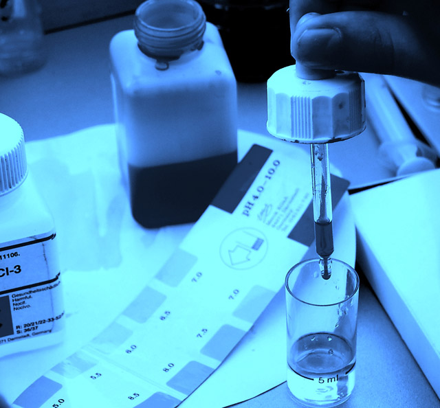
The blue cast is an interesting choice, and the chemistry subject is of course very obvious in this shot. I'm not too keen on the square crop, as I think there needs to be a reason to crop square from a creative perspective in order for it to work properly. Ideally, the bottle on the left should have been more visible as my eye is drawn to it to try to work out what the writing/bottle is. Overall 6.
While I like the tungsten feel, because you are using a pH test as the subject, the cool colours you'd see in a non-tinted photo may have a better impact





 Add photograph to your favorites
 Add photographer to your favorites


 Photographer found comment helpful.


