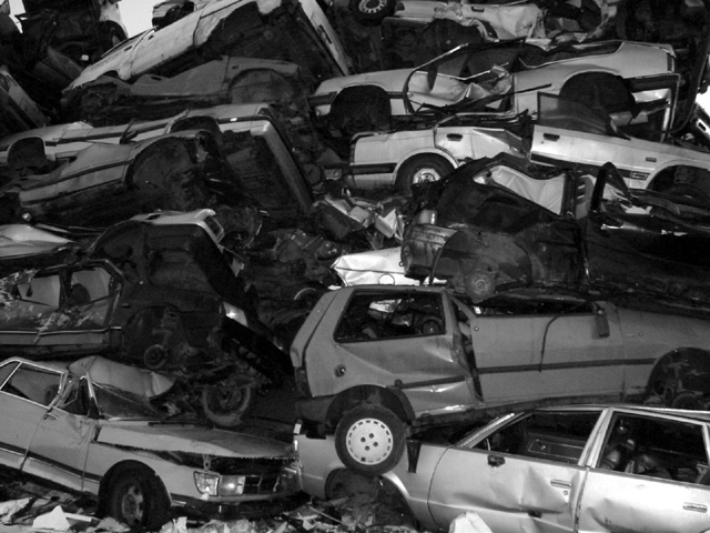
Interesting subject. I like how all the trashed cars are stacked up. The lighting looks a bit shallow and boring. I don't know the original image but you probably chose black&white for a reason. However, it only makes it look more flat in this case. Maybe a different angle? Maybe from a little below to show how tall this stack is? Just an idea. Also to me the photo looks a bit unsharp. Maybe a little postprocessing (sharpening is allowed) could have helped that. -stephan
did you use a flash here? for stuff like this, where there are small reflective light sources, i like to use a long exposure and a tripod. this is nice, though, that's not a criticism.
Technically correct , exposure, focus, saturation , contrast.5 Good composition. 4 Tells a story or creates a mood 5 Impact to the viewer 4 would have made more of an impact in colour Relevance to the Challenge 6 Overall 5 sulamk






 Add photograph to your favorites
 Add photographer to your favorites


