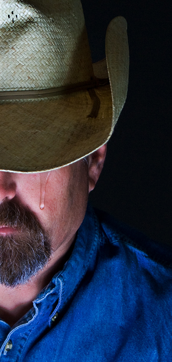
Great idea, unfortunately the tear does not appear realistic, mainly because it is tapering in the wrong direction. Also, I thing it would have looked better in duotone.
I really like the idea and the composition has strong bones but it needs a little more work to push it into the above average category. First off, wonderful idea to have a cowboy show emotion and capturing a tear falling down his face. But without the title there is no other element IN the composition itself to SPECIFICALLY show mourning the loss of a fallen comrade. "Show us" will strengthen the emotional and visual impact far more than just "Telling us". One example would be is to have a cross in silhouette and perhaps a sunset in the backdrop just over his shoulder. Lighting is good for it illuminates his face but could be better for there are deep shadows that fall on his neck from the collar - try experimenting with the light set up to avoid the deep shadows. Lighting on the tear is good because it is very visible. However there is something about the tear that makes it look a little artificial. The width of the top of the tear is much fatter than the thin trail and the pear drop of the end of the tear. 'Thin' that up and it will look more natural. Now to the other 'strong bones' of the composition. I like that you only show us half the face for it is a visual cue that this cowboy has lost his best mate such that a portion of him has been 'ripped' away as he grieves. Next we do not see the eye 'which is a window to the soul' but we do see a single tear. The fact that the brim covers the eye of the cowboy immediately calls attention to the tear.
Hmmm. Not sure whether to laugh or cry. I understand the sentiment, but the "tear" seems a little overstated. On a technical note, the white in the beard has a strong bluish cast.





 Add photograph to your favorites
 Add photographer to your favorites


 Photographer found comment helpful.


